AFTER this block, and index.html defines its own opacity-based `shimmer`, which silently overrode this transform-based one on that page. Do not rename it back. */ .skel-shimmer { position: relative; overflow: hidden; background: var(--bg-secondary); border: 1px solid var(--border); } .skel-shimmer::after { content: ''; position: absolute; top: 0; left: 0; right: 0; bottom: 0; background: linear-gradient(90deg, transparent 0%, rgba(255,255,255,0.03) 50%, transparent 100%); animation: skelShimmer 1.8s infinite; } @keyframes skelShimmer { 0% { transform: translateX(-100%); } 100% { transform: translateX(100%); } } /* A skeleton must never out-shout real content. The sweep is a 3% white wash over --bg-secondary; with motion off it holds that plate at rest instead of flashing. */ @media (prefers-reduced-motion: reduce) { .skel-shimmer::after { animation: none; background: rgba(255,255,255,0.02); } } .skel-title { height: 0.65rem; width: 40%; margin-bottom: 1rem; } /* A single line of stand-in text. Height is set by the caller to the line-height of the text it stands in for; width modifiers keep a block of them from reading as a solid rectangle. */ .skel-line { height: 0.7rem; display: block; } .skel-w10 { width: 10%; } .skel-w15 { width: 15%; } .skel-w20 { width: 20%; } .skel-w25 { width: 25%; } .skel-w30 { width: 30%; } .skel-w40 { width: 40%; } .skel-w50 { width: 50%; } .skel-w60 { width: 60%; } .skel-w70 { width: 70%; } .skel-w85 { width: 85%; } .skel-w100 { width: 100%; } /* Skeletons are decorative. Screen readers get the one honest sentence on the wrapper (aria-busy + aria-label), never a pile of empty divs. */ .skel-wrap { position: relative; } .skel-stats { display: grid; grid-template-columns: repeat(3, 1fr); gap: 0.75rem; margin-bottom: 2rem; } .skel-stat { height: 5rem; } .skel-table-row { height: 2.2rem; margin-bottom: 0.35rem; } .skel-table-row:nth-child(2) { animation-delay: 0.1s; } .skel-table-row:nth-child(2)::after { animation-delay: 0.1s; } .skel-table-row:nth-child(3) { animation-delay: 0.2s; } .skel-table-row:nth-child(3)::after { animation-delay: 0.2s; } .skel-table-row:nth-child(4) { animation-delay: 0.3s; } .skel-table-row:nth-child(4)::after { animation-delay: 0.3s; } .skel-table-row:nth-child(5) { animation-delay: 0.4s; } .skel-table-row:nth-child(5)::after { animation-delay: 0.4s; } .skel-table-row:nth-child(6) { animation-delay: 0.5s; } .skel-table-row:nth-child(6)::after { animation-delay: 0.5s; } .skel-table-row:nth-child(7) { animation-delay: 0.6s; } .skel-table-row:nth-child(7)::after { animation-delay: 0.6s; } .skel-table-row:nth-child(8) { animation-delay: 0.7s; } .skel-table-row:nth-child(8)::after { animation-delay: 0.7s; } @media (max-width: 768px) { .skel-stats { grid-template-columns: repeat(2, 1fr); } } /* ── Honest states ── the two ways a skeleton is allowed to end. A fetch that returns nothing says WHY and offers a next step; a fetch that FAILS says so plainly and offers a retry. Neither is ever a bare "No data", and neither is ever left shimmering. Sentence case, never the uppercase tracking of .empty-state - these are sentences a human reads, not labels. */ .state-block { text-align: center; padding: 2rem 1.25rem; color: var(--text-secondary); font-size: 0.9rem; line-height: 1.6; text-transform: none; letter-spacing: 0; } .state-block .state-title { color: var(--text-primary); font-weight: 600; margin-bottom: 0.3rem; } .state-block .state-hint { color: var(--text-muted); font-size: 0.82rem; margin-top: 0.35rem; } .state-block a { color: var(--blue-text); text-decoration: underline; text-underline-offset: 2px; } .state-block.is-error .state-title { color: var(--red-text); } /* Retry is a real button, not a link that reloads the world. */ .state-retry { margin-top: 0.75rem; background: var(--bg-secondary); border: 1px solid var(--border); color: var(--text-primary); font-family: inherit; font-size: 0.8rem; padding: 0.45rem 0.9rem; cursor: pointer; letter-spacing: 0.05em; min-height: 36px; } .state-retry:hover, .state-retry:focus-visible { border-color: var(--blue-text); color: var(--blue-text); } /* ── Keyboard focus ── ONE governed ring for the whole app. Every interactive element gets a visible indicator for keyboard users; :focus-visible means a mouse press never draws it, so there is no reason for a page to opt out with `outline: none`. --blue-text on the ground is 7.67:1, far above the 3:1 minimum for UI controls (docs/product/ui-contrast.md). This is the ring landing-styles.ts already used on .lx / .xray - adopted fleet-wide, not invented here. Page styles load AFTER this block, so the few rules that set their own focus outline are matched to these values rather than left to fight the cascade. */ :focus-visible { outline: 2px solid var(--blue-text); outline-offset: 2px; } a:focus-visible, button:focus-visible, input:focus-visible, textarea:focus-visible, select:focus-visible, summary:focus-visible, [tabindex]:focus-visible, [role="option"]:focus-visible, [role="button"]:focus-visible { outline: 2px solid var(--blue-text); outline-offset: 2px; } /* The search inputs sit inside a bordered wrapper, so the ring goes on the WRAPPER (an outline on the borderless input would draw inside the box and read as a glitch). */ .np-search:focus-within { outline: 2px solid var(--blue-text); outline-offset: 2px; } .np-search input:focus-visible { outline: none; } /* ── Smooth transitions ── */ a, .nav a, input { transition: all 0.2s ease; } /* ── Touch targets ── */ .nav a { min-height: 44px; display: inline-flex; align-items: center; } /* ── No horizontal scroll ── */ .container { box-sizing: border-box; overflow-wrap: break-word; } @media (max-width: 980px) { body { font-size: 15px; } /* A REAL gutter: content never touches the screen edge. 20px each side (was 12px), plus the safe-area inset on notched phones. This is the single biggest mobile fix. */ .container { padding: calc(1.25rem + env(safe-area-inset-top)) calc(1.25rem + env(safe-area-inset-right)) 1.75rem calc(1.25rem + env(safe-area-inset-left)); max-width: 100%; } .header { padding-bottom: 0.85rem; margin-bottom: 1.5rem; } /* Clean single row: logo left, hamburger right. The nav becomes a floating dropdown so no label ever wraps to a second line. A small gap + soft shadow makes it read as a raised panel; hairline dividers give it structure instead of a bland stack. */ .header { flex-direction: row; align-items: center; justify-content: space-between; gap: 0.75rem; } .nav-toggle { display: inline-flex; } .nav { position: absolute; top: calc(100% + 8px); left: 0; right: 0; flex-direction: column; align-items: stretch; gap: 0; background: var(--bg-card); border: 1px solid var(--border); box-shadow: 0 22px 54px rgba(0,0,0,0.6), 0 0 0 1px rgba(96,165,250,0.08); padding: 0.4rem 0.55rem 0.6rem; display: none; z-index: 60; } .nav.open { display: flex; } .nav a { font-size: 0.9rem; min-height: 50px; display: flex; align-items: center; width: 100%; padding: 0.8rem 0.9rem; letter-spacing: 0.1em; border-bottom: 1px solid rgba(42,37,80,0.5); } .nav a:last-child { border-bottom: 0; } .nav a:hover, .nav a:focus-visible { background: var(--bg-secondary); color: var(--blue-text); } .nav .logout { margin-left: 0; width: 100%; justify-content: flex-start; gap: 0.5rem; border-bottom: 0; } .nav a.cta { justify-content: center; text-align: center; margin-top: 0.6rem; border-bottom: 0; box-shadow: 0 8px 22px rgba(29,78,216,0.35); } .logo { font-size: 1.1rem; } } @media (max-width: 480px) { /* Keep the full gutter on the smallest phones - 18px, never the old 8px. */ .container { padding: calc(1rem + env(safe-area-inset-top)) calc(1.15rem + env(safe-area-inset-right)) 1.5rem calc(1.15rem + env(safe-area-inset-left)); } } /* ── The DomainDrift tape ── 24h rollup stats rolling full-bleed above the app chrome (the MorScan pattern). Seamless loop = duplicated half + -50% translate. Pauses on hover/focus; reduced-motion freezes to the first half. Injected via the DD_TAPE slot by utils/tape.ts. */ .tape { background: var(--bg-primary, #0a0e1a); border-bottom: 1px solid var(--border); overflow: hidden; white-space: nowrap; } .tape-track { display: inline-flex; align-items: center; animation: tapeScroll 80s linear infinite; will-change: transform; } .tape:hover .tape-track, .tape:focus-within .tape-track { animation-play-state: paused; } @keyframes tapeScroll { from { transform: translateX(0); } to { transform: translateX(-50%); } } .tape-half { display: inline-flex; align-items: baseline; gap: 1.6rem; padding: 0.42rem 1.6rem 0.42rem 0.9rem; } .tape-brand { font-size: 0.62rem; font-weight: 800; letter-spacing: 0.24em; color: var(--text-muted); font-family: var(--mono); } .tape-item { display: inline-flex; align-items: baseline; gap: 0.42rem; font-size: 0.72rem; line-height: 1.4; } .tape-l { font-size: 0.6rem; font-weight: 700; letter-spacing: 0.16em; color: var(--text-muted); font-family: var(--mono); } .tape-v { color: var(--blue-text, #60a5fa); font-weight: 700; text-decoration: none; font-family: var(--mono); } .tape-v:hover { text-decoration: underline; } /* Tape tones: blue = baseline / reachability (informational), DRM3 PINK = drift (something moved - the brand accent, and distinctly NOT red so it never reads as an incident), green = signed/up, amber = blocked/errors, red = down ONLY. Three colors so the tape is not a wall of blue-and-amber. Red is earned by real failure, never by a routine change. */ .tape-v.tape-drift { color: var(--pink); } .tape-v.tape-ok { color: var(--green-text); } .tape-v.tape-warn { color: var(--amber-text); } .tape-v.tape-crit { color: var(--red-text); } .tape-s { color: var(--text-muted); font-size: 0.68rem; } @media (max-width: 500px) { .tape-item { font-size: 0.66rem; } .tape-half { gap: 1.05rem; } } @media (prefers-reduced-motion: reduce) { .tape-track { animation: none; } } /* ── Mobile overflow safety net ── nothing in the page body may force the viewport wider than the screen (the "wobble"). Wide tables/code/media scroll inside their own box instead of dragging the whole page. */ #page-content { max-width: 100%; } #page-content img, #page-content svg, #page-content video { max-width: 100%; height: auto; } @media (max-width: 768px) { #page-content table { display: block; width: 100%; overflow-x: auto; -webkit-overflow-scrolling: touch; } #page-content pre, #page-content code { max-width: 100%; overflow-x: auto; } #page-content { overflow-wrap: anywhere; } } /* ===== Consolidated menu: 4-parent spine + dropdowns + conversion cluster (2026-07-14). The spine is identical signed out/in; only the cluster swaps. Dropdown items deliberately RESET the uppercase/letter-spaced `.nav a` base so they read as sentence-case menu rows. ===== */ /* Native
/ disclosure: clicking the summary toggles open/closed with zero JS, so a dropdown can NEVER get stuck open. JS below only closes siblings + on outside/Esc. */ .np { position: relative; display: flex; align-items: center; } .np-top { list-style: none; background: none; border: 0; cursor: pointer; color: var(--text-secondary); font-family: var(--font-display); font-size: 0.9rem; font-weight: 500; letter-spacing: 0; text-transform: none; padding: 0.5rem 0.6rem; border-radius: var(--r-sm); display: inline-flex; align-items: center; gap: 0.32rem; white-space: nowrap; min-height: 44px; } .np-top:hover { background: var(--blue-dim); } .np-top::-webkit-details-marker { display: none; } .np-top::marker { content: ""; } .np-top:hover, details.np[open] > .np-top { color: var(--blue-text); } .np-car { width: 8px; height: 8px; flex: none; transition: transform 0.18s ease; } details.np[open] > .np-top .np-car { transform: rotate(180deg); } .np-flat { display: inline-flex; align-items: center; } .np-menu { position: absolute; top: calc(100% + 8px); left: 0; z-index: 70; background: var(--bg-card); border: 1px solid var(--border); box-shadow: 0 24px 60px rgba(0,0,0,0.6), 0 0 0 1px rgba(96,165,250,0.06); padding: 0.5rem; min-width: 252px; display: none; } details.np[open] > .np-menu { display: block; } /* The mega keeps its two-column grid when open (the plain block rule above would flatten it). */ details.np[open] > .np-menu.np-mega { display: grid; } .np-menu-right { left: auto; right: 0; } .np-mega { display: grid; grid-template-columns: 1fr 1fr; gap: 0.2rem 1.3rem; min-width: 520px; padding: 0.85rem 1rem; } .np-col-h { font-family: var(--mono); font-size: 0.6rem; letter-spacing: 0.2em; text-transform: uppercase; color: var(--text-muted); padding: 0.15rem 0.5rem 0.45rem; border-bottom: 1px solid var(--border); margin-bottom: 0.3rem; } .nav .np-menu a.mi { display: flex; flex-direction: column; gap: 0.08rem; align-items: flex-start; padding: 0.5rem 0.55rem; color: var(--text-primary); font-size: 0.86rem; font-weight: 600; text-transform: none; letter-spacing: normal; white-space: normal; min-height: 0; border-bottom: 0; line-height: 1.25; } .nav .np-menu a.mi:hover { background: var(--bg-secondary); color: var(--blue-text); } .mi-d { font-size: 0.72rem; font-weight: 400; color: var(--text-muted); text-transform: none; letter-spacing: normal; } .mi-sep { border-top: 1px solid var(--border); margin-top: 0.35rem; } /* Explore mega-menu: icon-led rows + a section kicker (with a count) + a utility footer row. */ .nav .np-menu.np-mega a.mi { flex-direction: row; align-items: flex-start; gap: 0.6rem; } .np-mega .mi-ic { flex: none; width: 20px; height: 20px; color: var(--blue-text); margin-top: 1px; } .np-mega .mi-ic svg { width: 20px; height: 20px; display: block; } .np-mega .mi-tx { display: flex; flex-direction: column; gap: 0.06rem; min-width: 0; } .np-mega .mi-t { font-size: 0.86rem; font-weight: 600; color: var(--text-primary); line-height: 1.25; } .np-mega-foot { grid-column: 1 / -1; display: flex; align-items: center; gap: 1.1rem; border-top: 1px solid var(--border); margin-top: 0.4rem; padding: 0.7rem 0.55rem 0.1rem; } .np-mega-foot a { font-size: 0.8rem; font-weight: 600; color: var(--text-secondary); white-space: nowrap; } .np-mega-foot a:hover { color: var(--blue-text); } .np-mega-foot .np-mega-more { margin-left: auto; color: var(--blue-text); } .pro { display: inline-block; font-family: var(--mono); font-size: 0.54rem; letter-spacing: 0.12em; text-transform: uppercase; color: var(--pink); background: var(--pink-dim); border: 1px solid rgba(251,61,142,0.42); padding: 0.02rem 0.32rem; margin-left: 0.4rem; vertical-align: middle; } .np-search { display: flex; align-items: center; gap: 0.45rem; background: var(--bg-secondary); border: 1px solid var(--border); padding: 0.35rem 0.55rem; margin-left: auto; flex: 0 1 210px; min-width: 130px; } .np-search:focus-within { border-color: var(--blue-text); } .np-search svg { width: 14px; height: 14px; color: var(--text-muted); flex: none; } .np-search input { flex: 1; min-width: 0; background: none; border: 0; outline: none; color: var(--text-primary); font-family: var(--font-display); font-size: 0.8rem; } .np-search input::placeholder { color: var(--text-muted); } .np-signin { display: inline-flex; align-items: center; } .np-watch { display: inline-flex; align-items: center; gap: 0.3rem; border: 1px solid var(--border); padding: 0.45rem 0.85rem; text-transform: none; letter-spacing: 0; font-size: 0.85rem; font-weight: 600; border-radius: var(--r-pill); } .np-watch:hover { border-color: var(--blue-text); color: var(--blue-text); } .acct-btn { border: 1px solid var(--border); padding: 0.25rem 0.5rem 0.25rem 0.35rem; letter-spacing: 0; border-radius: var(--r-pill); } .acct-btn:hover, details.np-acct[open] > .acct-btn { border-color: var(--blue-text); } .acct-ava { width: 24px; height: 24px; background: var(--blue-dim); border: 1px solid rgba(96,165,250,0.4); color: var(--blue-text); font-weight: 700; font-size: 0.78rem; display: inline-flex; align-items: center; justify-content: center; } .acct-label { display: none; } @media (max-width: 980px) { /* Flatten: the collapsed hamburger panel shows every parent as a section with its rows inline (no hover popouts, no absolute positioning that would overflow the panel). */ .np { flex-direction: column; align-items: stretch; width: 100%; } .np-top { width: 100%; justify-content: space-between; min-height: 50px; padding: 0.8rem 0.9rem; letter-spacing: 0.1em; border-bottom: 1px solid rgba(42,37,80,0.5); } .np-car { display: none; } details.np[open] > .np-menu { position: static; display: block; box-shadow: none; border: 0; min-width: 0; padding: 0; background: transparent; } .np-mega { grid-template-columns: 1fr; min-width: 0; padding: 0; gap: 0; } .np-col-h { padding: 0.6rem 0.9rem 0.35rem; } .nav .np-menu a.mi { padding: 0.7rem 0.9rem 0.7rem 1.4rem; border-bottom: 1px solid rgba(42,37,80,0.35); } /* The mega footer wraps on a phone so "Browse all views" can't get shoved off the right edge. */ .np-mega-foot { flex-wrap: wrap; gap: 0.6rem 1.1rem; padding: 0.7rem 0.9rem 0.4rem; } .np-mega-foot .np-mega-more { margin-left: 0; } .np-search { margin: 0.5rem 0; flex-basis: auto; width: 100%; } .np-signin, .np-watch { width: 100%; justify-content: center; margin-top: 0.4rem; } .acct-label { display: inline; margin-left: 0.4rem; } .acct-btn { width: 100%; justify-content: flex-start; min-height: 50px; } } /* ===== OBSERVATORY REFRESH (2026-07-14) — governed radii on the shared chrome. Replaces the old blanket `border-radius:0 !important`. Palette + contrast unchanged; this only softens the corners of buttons, inputs, menus, and the account chip so nothing reads as a terminal box. ===== */ .np-menu { border-radius: var(--r); } .np-search { border-radius: var(--r-pill); padding: 0.4rem 0.75rem; } .acct-ava { border-radius: var(--r-pill); } .nav-toggle { border-radius: var(--r-sm); } input, textarea, button { border-radius: var(--r-sm); } .cta { box-shadow: var(--shadow-sm); } /* ===== OBSERVATORY REFRESH — PAGE-BODY RADII (2026-07-14). The chrome rounds above; this governs every PAGE body from one place so no card/panel/chip/button ships square next to the rounded chrome. Scoped to #page-content so it never touches nav/tape/footer. The namespaced specificity (0,1,1) beats a bare page `.class` (0,1,0), so it also normalizes the few off-scale literals (e.g. .chg-badge 3px). Joined panels (the gate) round in their own CSS. ===== */ /* PILL — status chips, badges, tags, count pills, thin bar tracks */ #page-content .tag, #page-content .pchip, #page-content .badge, #page-content .badge-local, #page-content .rcnt, #page-content .sub-tag, #page-content .svc-cat, #page-content .im-host, #page-content .im-domain, #page-content .chg-badge, #page-content .ep-method, #page-content .col-category, #page-content .change-count, #page-content .filter-badge, #page-content .adv-pill, #page-content .progress-bar-wrap, #page-content .cat-count, #page-content .svc-bar, #page-content .issuer-bar, #page-content .q-badge, #page-content .q-bar-track, #page-content .pill, #page-content .xray-status, #page-content .xray-v .chip, #page-content .cmp .chip, #page-content .drift-chip, #page-content .cr-event, #page-content .sr-kind, #page-content .mtag, #page-content .al-tag, #page-content .bl-badge, #page-content .bl-ok, #page-content .bl-drift, #page-content .bl-wait, #page-content .gr-badge, #page-content .gr-monitored, #page-content .gr-queued { border-radius: var(--r-pill); } /* SM — buttons, small controls, small clickable list rows */ #page-content .btn, #page-content .btn-primary, #page-content .btn-ghost, #page-content .ex, #page-content .prov-toggle, #page-content .verify-btn, #page-content .dd-btn, #page-content .pager a, #page-content .pager span, #page-content .api-tab, #page-content .btn-run, #page-content .key-mask, #page-content .key-btn, #page-content .tab, #page-content .toggle-btn, #page-content .page-btn, #page-content .adv-toggle, #page-content .domain-row, #page-content .change-item, #page-content .svc-row, #page-content .issuer-row, #page-content .q-refresh, #page-content .sr-row, #page-content .sr-try, #page-content .search-kbd, #page-content .ep-btn, #page-content .pg-run, #page-content .pg-cta a, #page-content .al-btn, #page-content .al-del, #page-content .gr-btn, #page-content .gr-del, #page-content .v-instructions code { border-radius: var(--r-sm); } /* R — cards, panels, containers, dropdowns, code & diff blocks */ #page-content .scan-card, #page-content .probe-card, #page-content .card, #page-content .cert-card, #page-content .cert-warning, #page-content .cert-error-banner, #page-content .prov, #page-content .svc-item, #page-content .json-view, #page-content .diff-block, #page-content .im-wrap, #page-content .im-lanes, #page-content .dd-list, #page-content .expiry-section, #page-content .chg, #page-content .v-pane, #page-content .v-stat, #page-content .v-toast, #page-content .key-bar, #page-content .ep-item, #page-content .pnl, #page-content .code, #page-content .term-box, #page-content .adv-panel, #page-content .domain-list, #page-content .q-stat, #page-content .xray, #page-content .feature, #page-content .watch-pitch, #page-content .search-box, #page-content .change-row, #page-content .pg-req, #page-content .pg-out, #page-content .pg-x402, #page-content .pg-cta, #page-content .cmp .box, #page-content .al-card, #page-content .al-flash, #page-content .gr-card, #page-content .gr-flash { border-radius: var(--r); } /* LG — large hero/feature/pricing panels */ #page-content .price-card { border-radius: var(--r-lg); }
CONTINUOUS INTERNET TELEMETRY24H DRIFT138 material changesacross 100 domains · -520 vs yesterdayCERT DRIFT3 domains switched issuing CA24h · +1 vs yesterdayNOW4,089 curated domains not answering+1,260 vs yesterdayERRORS26,438 responded with an errorlast probe · 5xx / 404 / TLSTHROTTLED78,141 throttled or blocked our scanner429 rate-limit / 403 bot-block24H DRIFT138 material changesacross 100 domains · -520 vs yesterdayCERT DRIFT3 domains switched issuing CA24h · +1 vs yesterdayNOW4,089 curated domains not answering+1,260 vs yesterdayERRORS26,438 responded with an errorlast probe · 5xx / 404 / TLSTHROTTLED78,141 throttled or blocked our scanner429 rate-limit / 403 bot-block

leap.app

Observed Jul 18, 2026, 12:09 UTC (2d ago). Every field below was attested with an Ed25519 signature at scan time.

Up right now
Runs onAmazon
Email byGoogle Workspace
Secured byAmazon
Also usesGoogle Search Console
web3_defi
Every line above is a signed observation. Check the math at the bottom of the page.
INFRASTRUCTURE MAPwhat leap.app actually stands on - every host below is a signed observation
leap.app
A / AAAA
52.52.19.254
Amazonserves the site
NS
ns71.domaincontrol.comns72.domaincontrol.com
domaincontrol.comanswers its DNS
MX
aspmx.l.google.comalt1.aspmx.l.google.comalt2.aspmx.l.google.comalt3.aspmx.l.google.com+1 more
Google Workspacereceives its email
TLS
leap.app
Amazonissued its certificate

DNS Records

A 1

  • 52.52.19.254

MX 5

  • 1aspmx.l.google.com
  • 5alt1.aspmx.l.google.com
  • 5alt2.aspmx.l.google.com
  • 10alt3.aspmx.l.google.com
  • 10alt4.aspmx.l.google.com

TXT 7

  • google-site-verification=t_pn_JOWht7_OejsIL4IBJqXmRWkGnXux2EsLsyS60w
  • amazonses:PZZ2+3jMFRRz9wH5asX2zftBVaaU15X4xbjKmm+E6uA=
  • google-site-verification=EWMUCWcY1JWh4DXJzT_LxseOZCJfOfuNJwuL7wqdKqs
  • google-site-verification=1jDDzDgEY0g0lpj08fHpI2FywC2PBo8rC0kufKiTuqo
  • google-site-verification=cs18jDpsMn_szgTLrAAdjgwd67ojYDRhSvH6x83WeG4
  • v=spf1 include:dc-aa8e722993._spfm.leap.app ~all
  • cursor-domain-verification-3j4hmf=KoaH8RHfFT8yg9Ok2Y2YOwRBu

NS 2

  • ns71.domaincontrol.com
  • ns72.domaincontrol.com

SOA 1

  • ns71.domaincontrol.com dns.jomax.net

TLS Certificates (3)

Common NameIssuerExpires
leap.app C=US, O=Amazon, CN=Amazon RSA 2048 M01 Wed, 21 Oct 2026 23:59:59 +0000
Amazon RSA 2048 M01 C=US, O=Amazon, CN=Amazon Root CA 1 Fri, 23 Aug 2030 22:21:28 +0000
Amazon Root CA 1 C=US, ST=Arizona, L=Scottsdale, O=Starfield Technologies, Inc., CN=Starfield Services Root Certificate Authority - G2 Thu, 31 Dec 2037 01:00:00 +0000

Subdomains (0)

None observed.

The proof

Signed at scan time. Check the math yourself. Every line above is part of one signed observation. Re-hash it and check the Ed25519 signature in your own browser; nothing leaves your machine.

Verify this receipt

Put the receipt on your own site. A live badge showing what DomainDrift observes and signs for leap.app. It updates itself. It attests a signed observation - not that the site is safe.
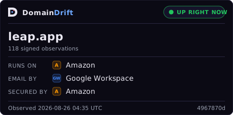
DomainDrift signed-observation badge for leap.app <a href="https://domaindrift.io/t/leap.app"> <img src="https://domaindrift.io/badge/leap.app.svg" width="300" height="64" alt="DomainDrift signed observations for leap.app"> </a>

Ed25519 Receipt

Receipt ID
7eb25c39-1140-4576-a817-46530f7ce290
Output Hash
15d2eb565e2f70bc4c6e0bdf6249910ba9323b3047a7d9f3413186c6f7f20c6c
Signature
ed25519:c6128296faeb3a2b74a5ebea485c1c63bf86c3f439f72dbc64e69cbd11867d199a8798e5d3583e4968a65aa9d549c9f1e4ced0f73ddafd246cc1f74460850105
Public Key
ed25519:178c3bd0f57d9d64b83cc4630753381e1a465005a2bbba3d032371f24af0bfd8
Parent
(genesis)
Plane
fast
Verify this in your browser